


Elevate Your Interiors
with Trendy Tiles Display
Tiles That Speak the Language of Design.
14th Jun, 2026
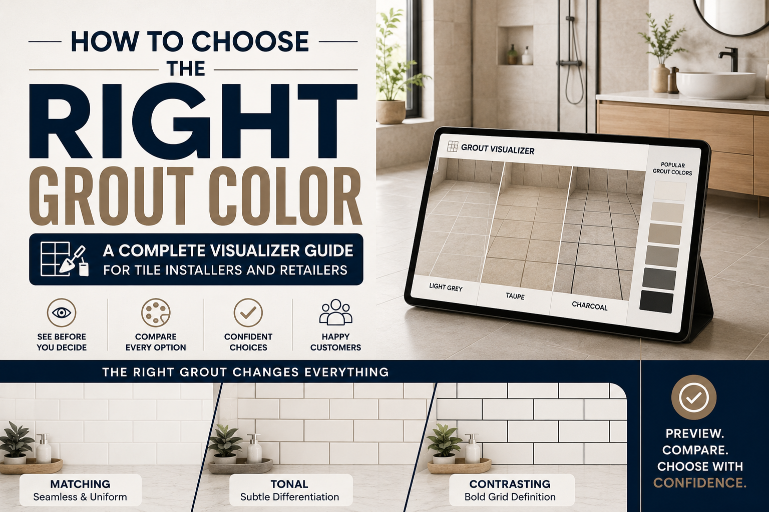
Grout is the most underestimated element in any tile installation. A customer spends weeks choosing the perfect tile, then selects the grout color in thirty seconds from a chart on the counter, without seeing what it will look like. The result is often an installation that looks almost right, or sometimes completely wrong.
This grout color guide changes that. It gives tile retailers, installers, and their customers a complete framework for grout color selection, from understanding how different grout colors affect the visual result, to using a tile visualizer to preview every combination before a single bag is mixed. When grout is chosen with as much care as the tile itself, the result is an installation that looks exactly as intended.

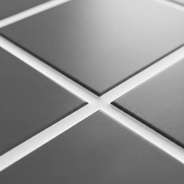
Grout color selection is not a secondary decision, it is a design decision with as much visual impact as the tile itself. The grout lines in a tile installation define the pattern, control the scale effect, influence the room's color temperature, and determine whether the tile reads as bold or subtle.
Consider a simple example from the grout comparison category. The same white subway tile installed with bright white grout reads as a smooth, almost monolithic surface where the tile lines recede. The same tile with dark charcoal grout creates a bold grid pattern where every tile is visually emphasized. These are fundamentally different interior design colors outcomes from identical tile products.
For tile retailers, this means grout color selection is not a post-purchase accessory sale, it is part of the tile design planning conversation that determines whether the customer is satisfied with their installation. A retailer who guides this conversation with a grout color guide and a tile visualizer is delivering real value that builds loyalty and reduces returns.
Key Takeaway: Grout accounts for 10–15% of a tile installation's total visual surface area. A wrong grout color selection is visible in every glance at the finished room and cannot be changed without re-grouting.
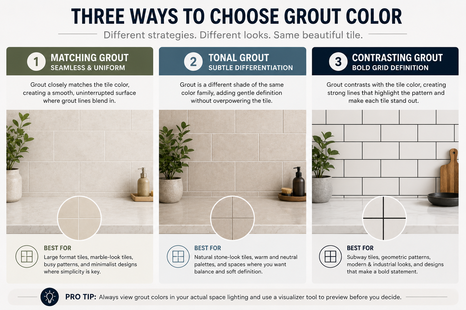
Every grout color decision falls into one of three strategies. Understanding which strategy suits the customer's design intent is the starting point of any grout color guide conversation.
Matching grout and tile involves selecting a grout color that closely matches the dominant color of the tile. The result is a unified, seamless-looking surface where grout lines are minimized and the tile pattern dominates. This is the most common approach for large-format tiles, where minimizing visible grout lines reinforces the sense of uninterrupted space.
Matching grout and tile works best when the tile has a strong pattern, texture, or color that should be the visual focus, as with marble-effect tiles, bold geometric patterns, or statement large-format porcelain. The tile color combinations in this strategy are designed to let the tile speak for itself.
The risk of matching grout: if the grout color is not precisely matched, the slight difference becomes more noticeable than a deliberately contrasting choice would be. Use the grout comparison feature in TilesDisplay to test multiple near-matching grout shades against the tile before ordering.
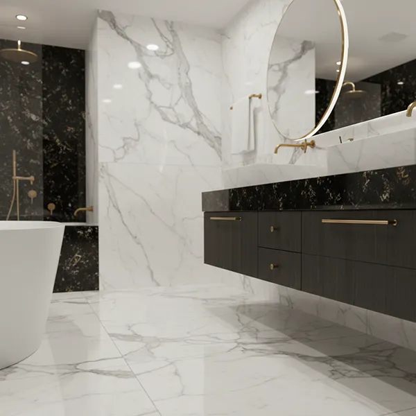
Contrasting tile grout color uses a grout that is significantly lighter or darker than the tile. The result is a defined grid pattern where every individual tile is visually framed. This works exceptionally well with certain tile design ideas, classic metro/subway tile with dark grout, terrazzo with contrasting color highlights, or white tiles with graphite grout for a graphic contemporary look.
From an interior design colors perspective, dark grout on light tiles adds visual weight and grounds a design. Light grout on dark tiles creates a graphic, luminous effect. Both are legitimate tile design planning choices, but both need to be previewed before commitment, because the visual impact of high-contrast grout color selection is much greater than customers typically anticipate from a grout color chart.
Tonal grout color selection falls between matching and contrasting, choosing a grout shade that is a different tone of the same color family as the tile. For example, a warm beige tile with a slightly darker taupe grout. The grout line is visible but not emphatic; it adds definition without creating a bold grid.
Tonal grout is one of the most sophisticated grout color guide approaches and is increasingly popular in contemporary tile design planning. It is also the approach most difficult to evaluate from a grout color chart, which makes the tile visualizer particularly valuable for this strategy.
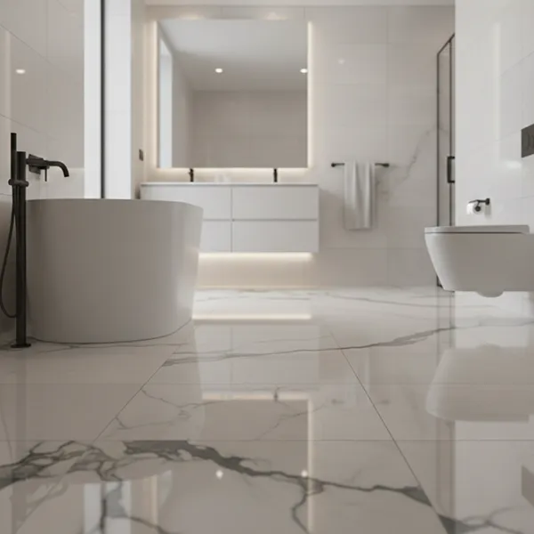
Bathroom tile grout is one of the most important maintenance and aesthetic decisions in a bathroom renovation. Lighter grout colors in shower areas and around bath surrounds, where water and soap residue are constant, will show staining more readily than medium or dark tones. However, very dark bathroom tile grout in shower enclosures can create a heavy, cave-like feeling in smaller bathrooms.
The tile finishing guide recommendation for most bathroom applications is a mid-tone grout beige, warm grey, or taupe, that balances aesthetic appeal with practicality. Use the bathroom tile grout preview in TilesDisplay to test mid-tones against your specific tile color before deciding. Epoxy grout in wet areas adds further stain resistance, which may influence color selection as epoxy colors differ from cement grout charts.
Floor tile grout takes more wear than any other application. High foot traffic, dirt transfer, and cleaning chemicals all affect both the appearance and longevity of floor grout. For floor tiles in high-traffic areas, hallways, kitchens, commercial spaces, medium-dark grout colors are a practical choice because they show dirt and wear far less than light-colored grout.
From a tile installation guide perspective, floor grout selection also affects how the room reads at eye level. Light floor tile grout creates a brighter, more open feeling. Dark floor tile grout creates definition and grounds the room. Preview both approaches with a floor tile grout comparison in the tile visualizer before installation to confirm the aesthetic outcome.
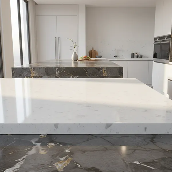
Kitchen tiles, particularly splashback tiles above worktops, are subject to oil, steam, and cleaning products. Tile installation tips for kitchens almost universally recommend sealed grout or epoxy grout for splashback areas. For grout color selection in kitchens, coordinate with the cabinetry and worktop colors: a white kitchen with marble-effect tiles typically suits either bright white grout for seamlessness or soft grey grout for subtle definition.
Feature wall tiles, geometric patterns, encaustic cement tiles, zellige, mosaic are a tile design ideas category where grout color selection has the most dramatic visual impact. The grout forms part of the pattern. A herringbone tile with contrasting grout creates an entirely different visual than the same tile with matching grout. Always use a tile visualizer to preview feature tile grout combinations before installation, the differences are profound.
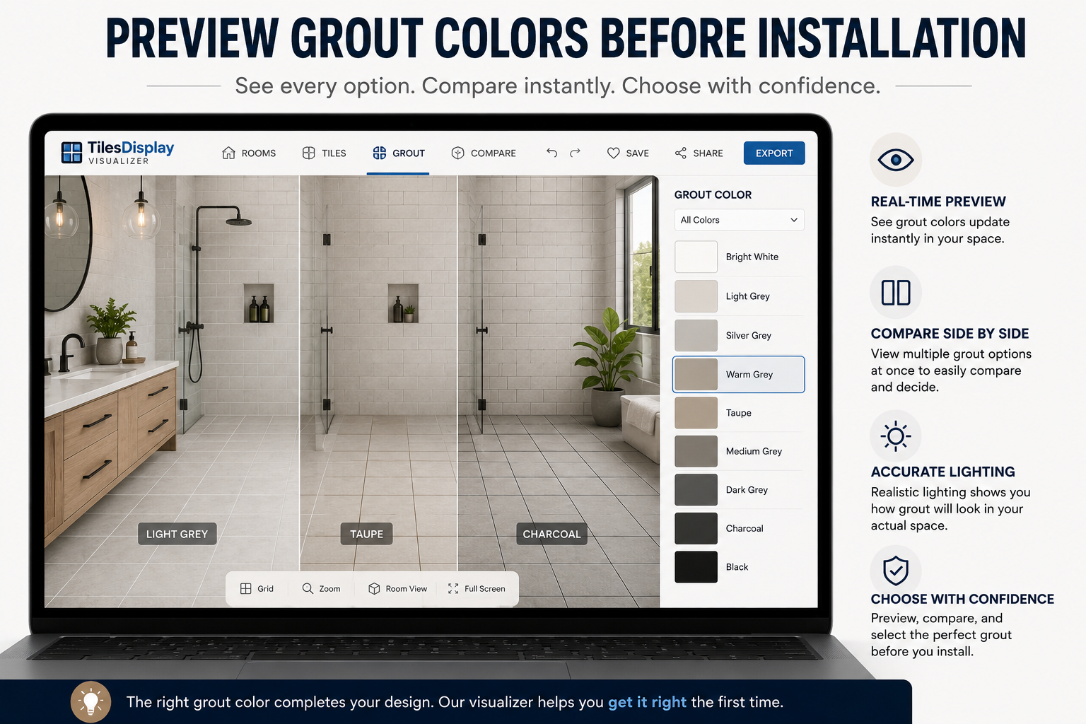
A tile visualizer with grout color preview capability is the most effective tool available for grout color selection. It removes the speculation from the grout color chart process entirely. Instead of imagining how a particular grout shade will look with a specific tile, the customer sees it applied to their actual room, at the correct scale, under their room's lighting conditions, alongside their existing fixtures.
This process takes five to ten minutes and eliminates the single most common source of post-installation dissatisfaction in tile projects. The grout comparison session in TilesDisplay is available on any device, customers can do it at home after visiting your showroom, with their partner, in the room they are tiling.
TilesDisplay grout color visualizer → tilesdisplay.in/grout-visualizer
Full tile visualization tool → tilesdisplay.in/wall-floor-visualizer
Tile design planning resources → tilesdisplay.in/tile-visualizer
A grout color chart is a useful starting point for grout color selection, it shows the available tones, allows comparison of finishes, and provides product reference codes for ordering. But it has one fundamental limitation: it cannot show how any specific grout color looks with a specific tile, at scale, in a specific room.
The tile visualizer does not replace the grout color chart, it extends it. The chart identifies the available options. The visualizer shows the customer what each option actually looks like in their installation. Together, they create a complete grout color guide process that removes uncertainty from both the selection and the ordering decision.
Retailer Tip: Print a QR code linking to your TilesDisplay grout visualizer and place it next to every grout color chart display in your showroom. Customers scan, preview, decide and your staff spend less time managing uncertainty and more time processing confident purchases.
Start with your tile design planning intent: do you want the grout to blend in, create subtle definition, or make a bold visual statement? Matching grout and tile creates seamlessness; contrasting tile grout color creates definition; tonal grout offers a middle ground. Use a tile visualizer to preview each approach with your specific tile before deciding.
White tiles work with a range of tile grout colors depending on the tile design ideas outcome you want. Bright white grout creates a seamless, minimal look. Soft grey grout adds subtle definition without heavy contrast. Dark charcoal or black grout creates a bold graphic pattern. Use a grout comparison tool to preview all three options in your actual room.
Significantly. Grout color selection affects how large or small a room feels, how heavy or light the floor or wall reads, and whether individual tiles are visually prominent or recede into a unified surface. Grout accounts for 10–15% of a tile installation's visible surface area, a grout color that is wrong is visible in every glance at the finished room.
For most bathrooms, a mid-tone bathroom tile grout, warm grey, taupe, or beige, balances aesthetics and practical maintenance better than very light or very dark options. Light grout in shower areas stains visibly; very dark grout can make smaller bathrooms feel heavy. The tile finishing guide recommendation is to use a tile visualizer to preview your specific tile and bathroom size before deciding.
A grout color chart is a display of available grout colors and finishes provided by grout manufacturers and tile retailers. It shows the available tones, textures, and product reference codes for ordering. A grout color chart is a useful starting point for grout color selection, but it does not show how specific grout colors look with specific tiles in a real room, that is what a tile visualizer provides.
Use a tile visualizer with a grout color selection tool, such as TilesDisplay. Upload a photo of your room or select a template, apply your chosen tile, and then browse and apply different grout colors to see the real-time result. This grout comparison process typically takes 5–10 minutes and eliminates the most common source of post-installation tile design dissatisfaction.
Cement-based floor tile grout should be sealed after installation and periodically thereafter particularly in wet areas, kitchens, and high-traffic floors. Sealing protects against staining and moisture penetration. Epoxy grout is inherently non-porous and does not require sealing, which is one reason it is the tile installation guide recommendation for shower floors and kitchen splashbacks.
Grout color selection is the tile design planning decision that most customers make too quickly, and most regret. A complete grout color guide conversation, supported by a tile visualizer that previews every combination in the customer's actual room, transforms this from a thirty-second counter decision into a confident, informed choice that delivers the installation the customer imagined.
For tile retailers and installers, making this conversation part of every sale builds trust, reduces post-installation dissatisfaction, and differentiates your business from competitors who hand the customer a grout color chart and leave them to guess. The grout comparison conversation is an opportunity to add value, use a tile visualizer to deliver it with certainty.
What is the most common grout color mistake you see customers make in your showroom and what would change if every customer previewed their grout choice before purchase?
Try TilesDisplay grout visualizer free → tilesdisplay.in/signup
Excerpt: Grout color selection is one of the most impactful and most overlooked decisions in any tile project. This complete grout color guide for tile retailers and installers covers every selection strategy, application-specific tile installation tips, and how to use a tile visualizer for grout comparison to preview every combination before the first bag is mixed.