


















Elevate Your Interiors
with Trendy Tiles Display
Tiles That Speak the Language of Design.
12th Jul, 2026
Have you ever stepped into a living room and instantly thought, "This space just feels right"? Chances are, it wasn't because of expensive furniture or designer décor. It was the perfect harmony between the walls and the flooring. When these two elements complement each other, they create a room that feels brighter, larger, and effortlessly stylish.
Choosing the right wall and floor tiles color combination for living room spaces is one of the most important decisions during any home renovation or new construction project. The colours you choose influence how spacious your room feels, how natural light flows through the space, and even how comfortable guests feel when they walk in. A thoughtful colour palette creates a timeless interior, while poorly matched colours can make even premium materials look disconnected.
The good news is that you no longer have to rely on imagination or tiny showroom samples. Modern tools like the Tilesdisplay AI Tile Visualizer let you upload a photo of your room and instantly preview different tile colour combinations before making a purchase. Instead of wondering whether a marble-look tile or wood finish will suit your walls, you can see realistic results within minutes.
Whether you're designing a compact apartment, renovating a family home, or planning a luxury living room, this guide will help you choose colour combinations with confidence. You'll discover expert design principles, practical examples, common mistakes to avoid, and modern ideas that work beautifully in real homes.
Explore our Living Room Tile Visualizer to preview different tile combinations before installation.
What Is a Wall and Floor Tiles Color Combination for Living Room?
A wall and floor tiles color combination for living room refers to selecting wall paint and floor tile colours that complement each other to create a balanced, functional, and visually appealing living space. The right combination improves natural lighting, enhances the sense of space, matches your furniture, and creates a cohesive interior that remains stylish for years rather than following short-lived trends.
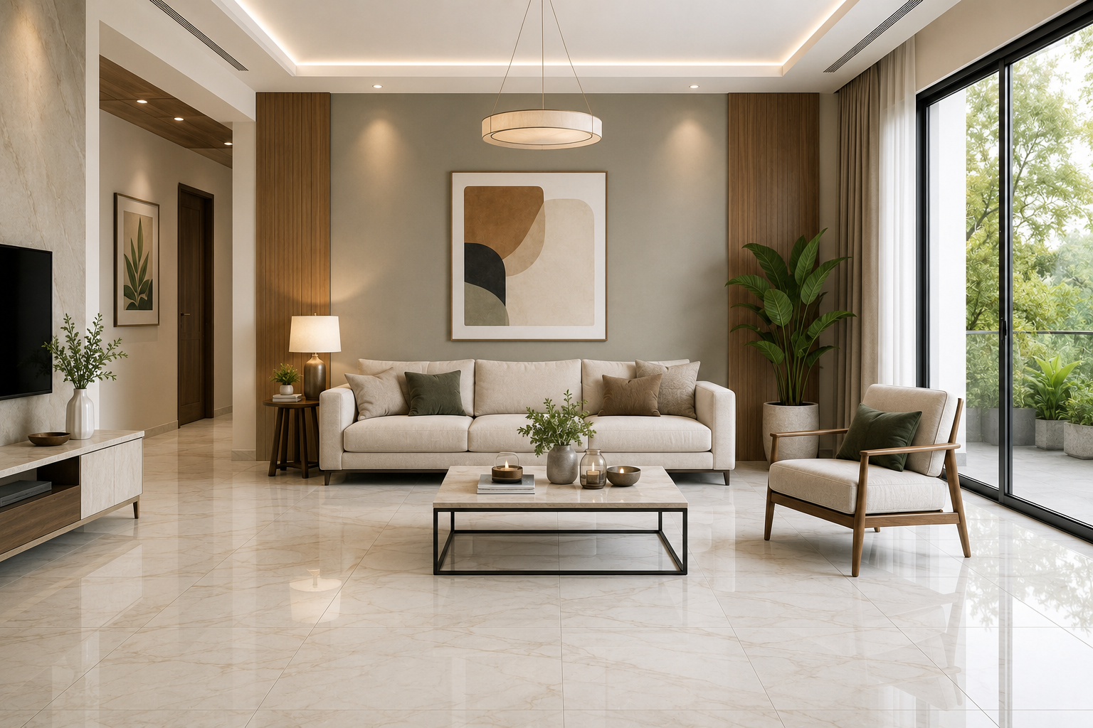
Many homeowners spend weeks selecting sofas, coffee tables, and lighting fixtures but only a few minutes deciding on tile colours. That's often where design problems begin. Your flooring covers the largest visible surface in the room, while your walls provide the backdrop for everything else. Together, they define the atmosphere of your home long before decorative accessories are added.
A carefully planned wall and floor tiles color combination for living room creates visual harmony, improves natural brightness, and helps furniture stand out without competing for attention. More importantly, it creates a room that feels comfortable every day instead of one that quickly feels outdated.
From our experience working with homeowners and interior professionals, the most successful living rooms rarely use the boldest colours. Instead, they rely on balanced palettes that combine timeless flooring with complementary wall shades. Neutral combinations continue to outperform trend-driven designs because they adapt easily to changing furniture, décor, and lifestyle needs.
Another advantage of choosing coordinated colours is visual continuity. If your living room connects to a dining area or kitchen, using complementary tones creates a seamless transition that makes the entire home feel larger and more refined.
Before comparing finishes or browsing catalogues, it's helpful to understand how colours influence the way a room feels. Interior designers don't choose colours randomly—they use colour psychology to shape the mood of a space.
Light colours such as white, ivory, cream, and soft grey reflect natural light, making rooms feel brighter and more spacious. These shades work particularly well in apartments or living rooms with limited daylight because they maximise available light throughout the day.
Darker colours like charcoal, graphite, and espresso brown create depth and sophistication. When balanced with lighter walls or natural textures, they add a premium look without making the room feel enclosed.
Warm tones—including beige, sand, taupe, and earthy browns—bring comfort and warmth to family spaces. Cooler shades such as sage green, blue-grey, and soft stone create a calm, contemporary atmosphere that's ideal for modern homes.
Rather than asking which colour is most popular, ask yourself a different question:
How do I want my living room to feel every time someone walks through the door?
That answer should guide every design decision that follows.
Design trends evolve every year, but certain tile colour combinations continue to perform exceptionally well because they offer balance, flexibility, and long-term appeal.
|
Floor Tile Colour |
Wall Colour |
Interior Style |
Overall Feel |
|
White |
Warm White |
Minimalist |
Bright & Spacious |
|
Light Grey |
Soft Beige |
Contemporary |
Calm & Balanced |
|
Marble Look |
Charcoal Accent |
Luxury |
Elegant |
|
Beige |
Sage Green |
Natural Modern |
Relaxing |
|
Wood Finish |
Cream |
Scandinavian |
Warm & Comfortable |
|
Concrete Grey |
White |
Industrial |
Clean & Modern |
|
Sand Stone |
Ivory |
Mediterranean |
Soft & Airy |
|
Dark Grey |
Light Grey |
Urban Modern |
Sophisticated |
If there's one recommendation professional designers consistently agree on, it's this: choose your flooring before selecting your wall colour.
Floor tiles are a long-term investment. Repainting walls is relatively quick and affordable, but replacing flooring requires significant time and expense. Starting with the floor helps build a colour palette that remains practical and timeless.
When selecting tiles, think beyond appearance. Consider your room size, natural lighting, furniture colours, and maintenance requirements. For example, porcelain floor tiles in medium tones are excellent for busy households because they hide dust better than glossy white surfaces, while marble-look finishes create an elegant focal point in contemporary interiors.
Once your flooring is finalised, build your wall palette around it. Instead of matching colours exactly, create subtle contrast using complementary shades. This approach produces more balanced floor and wall color combinations and allows furniture, artwork, and decorative pieces to stand out naturally.
Before making your final decision, evaluate these important factors:
Remember, the goal isn't simply to choose attractive colours. It's to create a cohesive room colour scheme that feels welcoming today and continues to look beautiful for years to come.
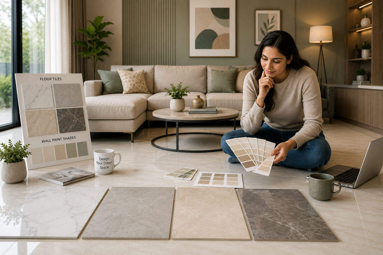
White floor tiles continue to be one of the most popular choices for modern homes because they create a clean, bright, and versatile foundation. However, the real design challenge isn't choosing the flooring—it's selecting the perfect wall color with white tile floor that brings warmth, balance, and personality to the space.
White flooring reflects natural light exceptionally well, making living rooms appear larger and more open. That's why it's a favourite in apartments, villas, and open-plan homes alike. The wrong wall colour, though, can make the room feel cold or overly clinical.
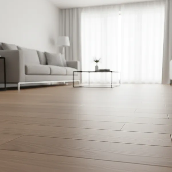
Warm neutrals such as ivory, cream, soft beige, and greige remain some of the safest options because they soften the crisp appearance of white tiles while maintaining brightness. If you prefer a more contemporary look, light grey walls introduce subtle contrast without reducing the spacious feel.
Homeowners looking for a little more character can explore muted sage green, dusty blue, or warm taupe. These colours add personality while still allowing the white flooring to remain the visual anchor of the room.
Texture matters just as much as colour. Matte wall paint paired with glossy white tiles creates visual balance, while textured wall panels, wooden furniture, or fabric décor prevent the room from feeling flat. Instead of adding more colours, introduce different materials that complement the flooring naturally.
One of the biggest advantages of white tiles is flexibility. As furniture styles and décor trends change over the years, repainting the walls is simple, allowing your living room to evolve without replacing the flooring.
Choosing paint becomes much easier once your flooring has been finalised. The best living room wall color ideas don't compete with your tiles—they enhance them.
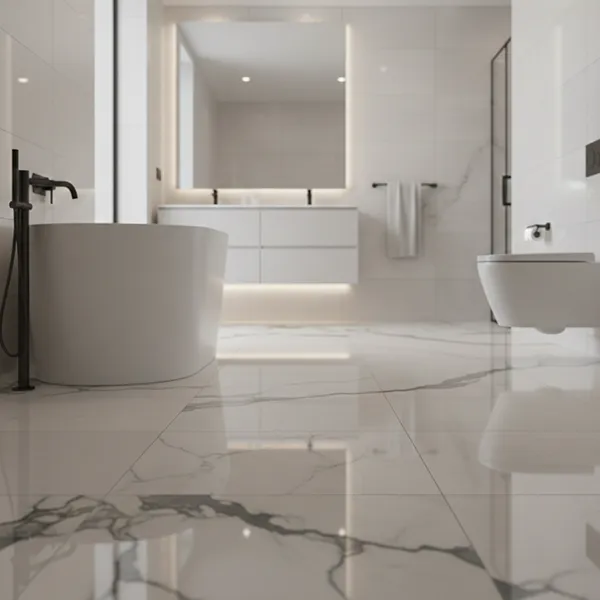
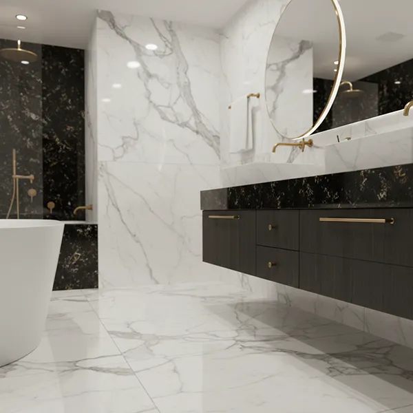
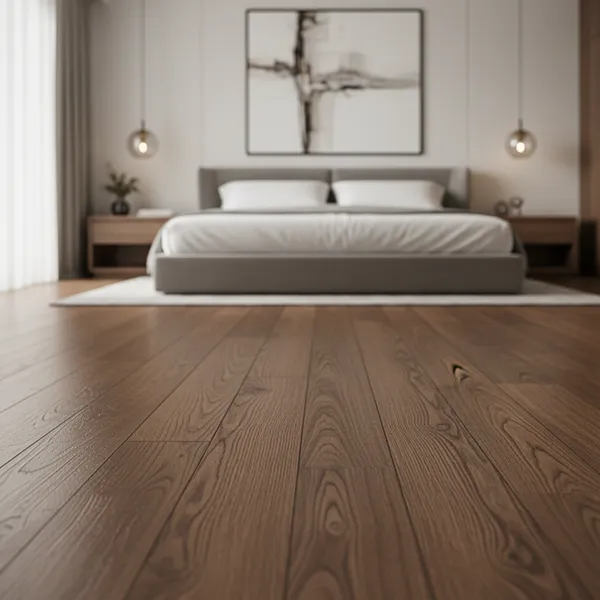
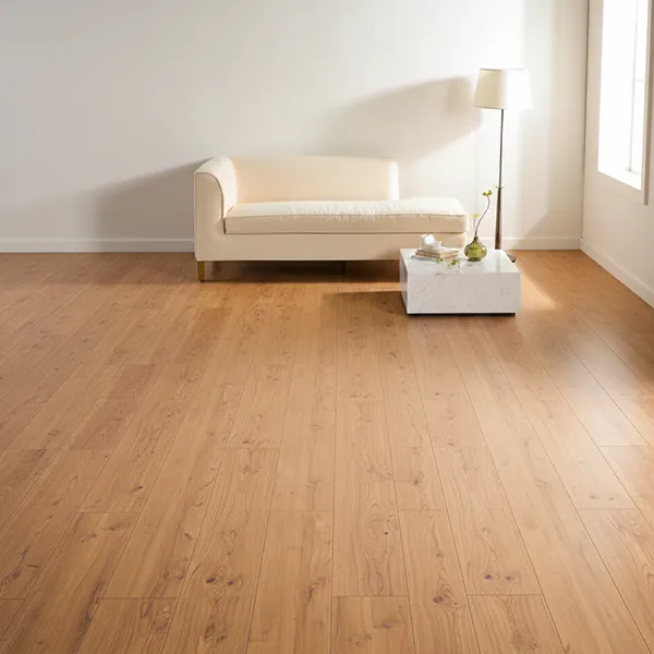
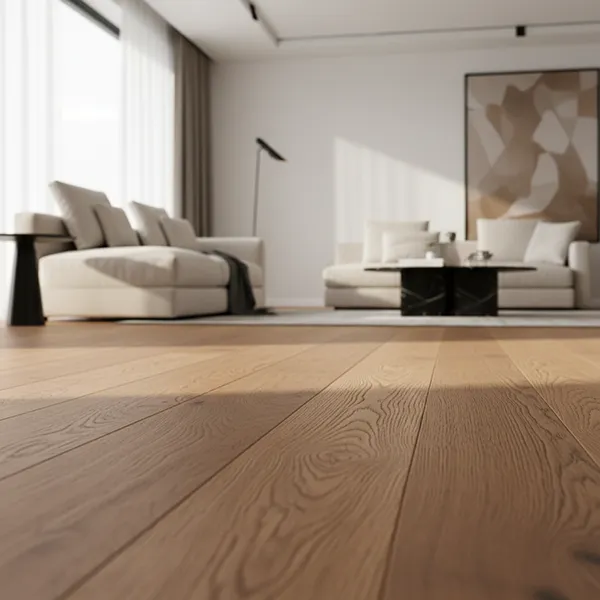
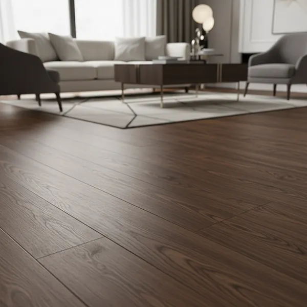
If you've selected marble-look porcelain tiles, warm white, ivory, or soft greige walls highlight the elegant veining while maintaining a luxurious atmosphere. Wood finish tiles pair beautifully with cream, sand, muted olive, or earthy beige tones, creating interiors inspired by Scandinavian and Japandi design.
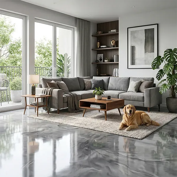
Grey flooring has become increasingly popular because it provides a neutral base that works with almost any décor style. Pairing grey floor tiles with off-white walls creates a timeless contemporary living room, while mushroom beige or warm taupe adds extra warmth without overpowering the space.
For homeowners who enjoy stronger design statements, consider a single accent wall behind the television unit or fireplace. Rich charcoal, forest green, or navy blue introduces depth while keeping the remaining walls light and balanced.
The best interiors don't use the greatest number of colours—they use colours with purpose.
Selecting the right flooring isn't simply about following trends. The best floor tile color ideas reflect your home's architecture, lighting conditions, and lifestyle.
Lighter shades such as white, ivory, and light grey are ideal for compact spaces because they reflect more natural light and make rooms appear larger. Medium tones like beige, greige, and soft stone provide warmth while hiding dust and everyday wear more effectively.
Darker colours, including charcoal and deep grey, create a premium appearance when balanced with lighter walls and sufficient natural lighting. They're particularly effective in spacious living rooms where dramatic contrast enhances the overall design.
Professional interior designers often recommend selecting timeless flooring colours for permanent surfaces while introducing seasonal trends through cushions, artwork, rugs, and decorative accessories. This approach keeps your home looking current without requiring major renovations.
Different materials influence how colours appear within a room. A polished marble tile reflects light differently from textured stone, while wood-look porcelain naturally introduces warmth that glossy ceramic surfaces may not.
Understanding these characteristics makes it much easier to create balanced interior colour combinations that suit your home's style.
|
Tile Material |
Recommended Wall Colours |
Best Interior Style |
|
Porcelain Floor Tiles |
Ivory, Greige, Soft Grey |
Contemporary |
|
Ceramic Wall Tiles |
Warm White, Beige |
Classic Modern |
|
Marble Look Tiles |
Cream, Charcoal Accent |
Luxury |
|
Wood Finish Tiles |
Sage Green, Sand, Ivory |
Scandinavian |
|
Concrete Finish Tiles |
White, Light Grey |
Industrial |
|
Natural Stone Tiles |
Earthy Beige, Olive |
Organic Modern |
Instead of selecting colours separately, always compare wall paint and tile samples together under natural daylight. Artificial showroom lighting often changes how colours appear once they're installed inside your home.
Choosing complementary shades becomes much easier when you compare the most popular options side by side.
|
Floor Tile Colour |
Recommended Wall Colour |
Best Interior Style |
Maintenance |
|
White |
Ivory, Cream, Beige |
Modern Minimalist |
Medium |
|
Grey |
White, Greige |
Contemporary |
Easy |
|
Beige |
Cream, Olive Green |
Classic |
Easy |
|
Marble Look |
Warm White, Soft Grey |
Luxury |
Medium |
|
Wood Finish |
Sage Green, Sand |
Scandinavian |
Easy |
|
Charcoal |
Light Grey, White |
Industrial |
Medium |
These combinations have remained popular because they work with a wide variety of furniture styles and decorative themes. Instead of chasing seasonal trends, investing in timeless colours gives your living room greater flexibility as your personal style evolves.
Every homeowner has a different vision for their living room. Some prefer clean, minimalist spaces with subtle colour contrasts, while others enjoy warm, traditional interiors filled with rich textures and natural materials. Both approaches can create beautiful results when supported by thoughtful matching wall and floor tiles.
Modern interiors typically feature restrained palettes built around white, charcoal, concrete grey, and soft beige. Large-format porcelain tiles, minimal grout lines, and clean architectural details create an uncluttered environment where furniture and artwork become the focal points.
Classic interiors focus more on warmth than contrast. Cream flooring, marble-inspired surfaces, earthy neutrals, and elegant decorative details create a welcoming atmosphere that rarely feels outdated. These spaces often include natural wood furniture, layered textiles, and warm lighting that complement the flooring rather than compete with it.
Neither approach is better than the other. The right choice depends on your lifestyle, your home's architecture, and the atmosphere you want to create. A cohesive neutral colour palette will almost always outperform a collection of fashionable colours that don't work together.
One of the biggest misconceptions in interior design is that the same colour strategy works for every room. In reality, room proportions have a significant influence on which colours perform best.
Smaller living rooms generally benefit from lighter flooring, reflective surfaces, and a carefully planned room colour scheme that maximises available light. Large-format tiles with fewer grout lines also create a cleaner appearance, making compact spaces feel less crowded.
Larger living rooms provide greater freedom. Darker flooring, richer wall colours, and stronger contrasts can add depth without making the room feel enclosed. These spaces also allow homeowners to experiment with statement furniture, feature walls, and layered textures more comfortably.
Here are a few practical guidelines to remember:
These simple principles apply equally well to apartments, family homes, and luxury residences.
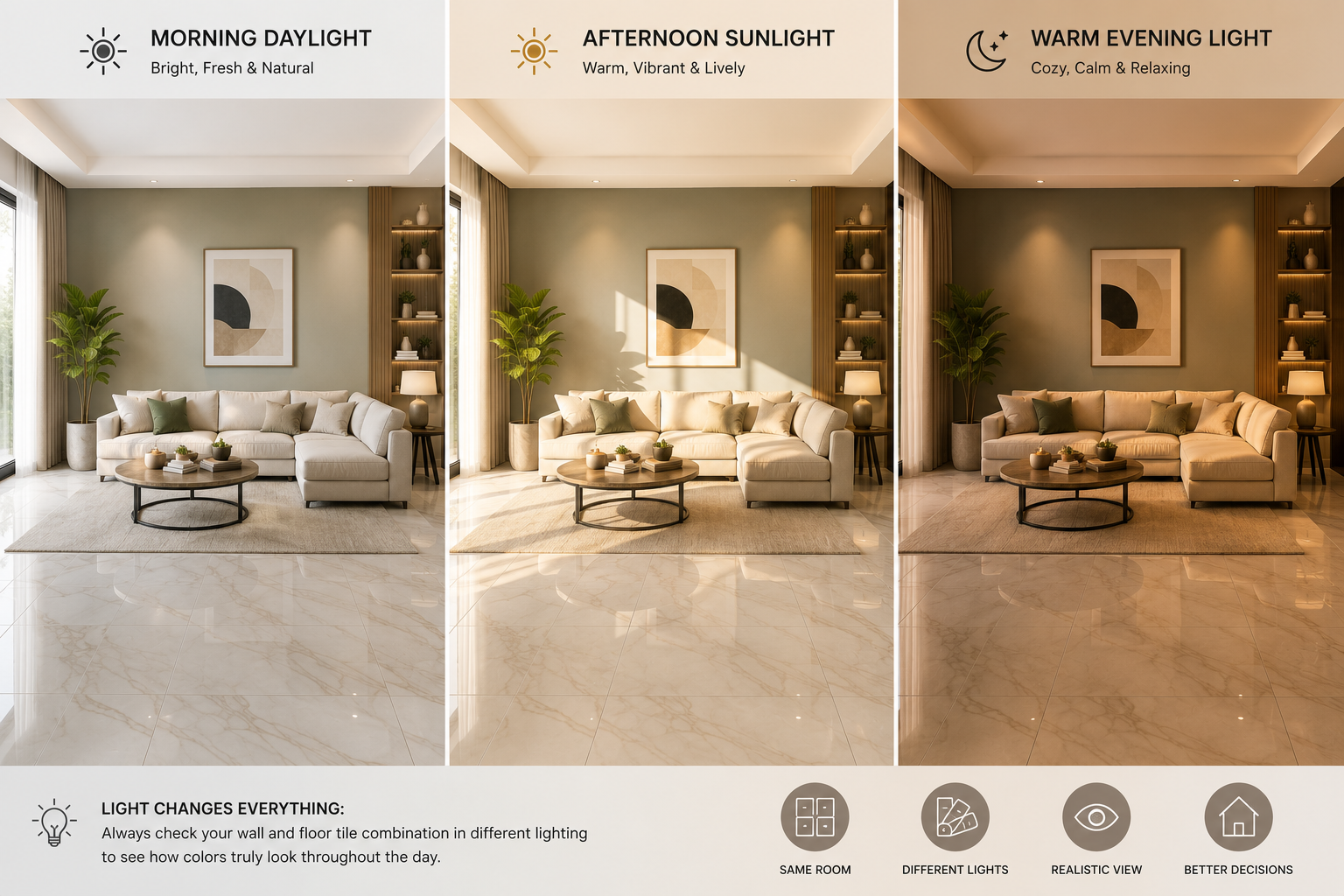
A tile that looks perfect in a showroom can appear completely different once installed in your home. The reason is simple—lighting changes everything.
Morning daylight reveals the true tone of your flooring, while afternoon sunlight can make warm colours appear richer. During the evening, warm LED lighting introduces golden undertones, whereas cool white lighting can make grey tiles appear slightly blue.
Before finalising your wall and floor tiles color combination for living room, examine tile samples under different lighting conditions throughout the day. What looks elegant in bright sunlight should also feel comfortable during evening family time.
This is one of the biggest reasons homeowners are turning to AI-powered visualization tools. Instead of imagining how colours might work together, you can preview multiple floor and wall color combinations inside your own room before making a long-term investment.
Compare different wall colours, tile finishes, and layouts using the Tilesdisplay Room Visualizer before choosing your final design.
Designing a living room used to involve multiple showroom visits, stacks of tile samples, and a lot of guesswork. Homeowners often had to imagine how a particular tile would look in their own space, only to discover after installation that the colours didn't work as expected. It was an expensive lesson that many people experienced at least once.
Today, that process has changed dramatically. An AI tile visualizer allows you to upload a photo of your living room and instantly preview different flooring options, wall colours, layouts, and finishes. Instead of relying on imagination, you can compare multiple tile colour combinations in a realistic environment before making any purchasing decisions.
For homeowners, this means greater confidence and fewer renovation mistakes. Interior designers can present ideas more clearly, while tile retailers can help customers make faster and more informed decisions. The technology saves time, reduces uncertainty, and creates a much smoother renovation experience.
Rather than asking, "Will these tiles look good in my home?" you can now answer that question before placing an order.
Home renovation has become far more research-driven than it was a decade ago. Instead of purchasing materials immediately after visiting a showroom, homeowners now compare designs, colours, prices, and layouts online before making a final decision.
This shift explains why digital visualization continues to grow in popularity.
Several industry trends support this change:
Instead of depending solely on physical tile samples, homeowners can now make smarter decisions using realistic previews that closely represent the finished space.
Interior design trends change every year, but the most successful living rooms are built around colours that remain attractive for years rather than months. Current trends focus less on bold statements and more on creating calm, comfortable spaces that feel welcoming every day.
Neutral shades continue to dominate modern homes. Warm whites, greige, beige, soft grey, muted olive, and earthy sand tones create timeless interiors that complement almost any furniture style. These colours also make it easier to update accessories without replacing permanent surfaces.
Natural textures are equally important. Porcelain floor tiles, wood-finish surfaces, marble-look designs, and stone-inspired textures bring depth and sophistication while maintaining a balanced appearance. Instead of filling a room with strong colours, designers now use texture and subtle contrast to create visual interest.
The result is a modern living room interior that feels elegant, practical, and easy to maintain.
Even high-quality tiles won't create an attractive interior if the colour planning is poor. Most design mistakes happen because homeowners select products individually rather than considering how every element works together.
Here are some of the most common mistakes and their solutions.
|
Common Mistake |
Better Solution |
|
Dark walls with dark floors |
Pair dark flooring with lighter wall colours. |
|
Too many bold colours |
Limit your palette to two or three dominant shades. |
|
Ignoring natural lighting |
Test colours at different times of the day. |
|
Matching walls and floors exactly |
Create gentle contrast using complementary tones. |
|
Following trends only |
Choose timeless colours for permanent surfaces. |
|
Forgetting adjoining rooms |
Repeat similar colours for a cohesive home design. |
Professional designers often say that simplicity creates elegance. A carefully planned neutral colour palette almost always looks more expensive than a room filled with competing colours and patterns.
Colour decisions should be made long before installation begins. Once floor tiles are fixed, changing them becomes costly and time-consuming. Careful planning reduces mistakes and ensures every design element works together from the beginning.
According to the U.S. General Services Administration (GSA), colour selection plays an important role in visual comfort, spatial perception, and overall interior usability. Their design guidance recommends considering surrounding materials, lighting conditions, and room function before finalising finishes. These same principles apply to residential interiors, helping homeowners create spaces that feel balanced, comfortable, and visually consistent.
You can explore these design principles through the official U.S. General Services Administration (GSA) website:
https://www.gsa.gov/
Whether you're designing a compact apartment or a spacious family home, thoughtful planning almost always produces better long-term results than choosing colours independently.
Choosing the perfect tile should feel exciting—not overwhelming. That's exactly why Tilesdisplay was created.
Instead of relying on imagination, Tilesdisplay allows homeowners to visualize tiles online using realistic room previews. By uploading your own room photo, you can compare multiple flooring styles, wall colours, layouts, and tile finishes before making a purchase.
With Tilesdisplay, you can:
Whether you're a homeowner planning your dream living room, an architect presenting ideas to clients, or a tile retailer assisting customers, Tilesdisplay provides the tools needed to transform ideas into reality.
Explore the AI Tile Visualizer to upload your room photo and compare different tile designs before installation.
Professional interiors rarely happen by accident. They are built on a few simple design principles that consistently produce elegant results regardless of budget.
From our experience working with homeowners and tile professionals, selecting your flooring first is one of the smartest decisions you can make. Floor tiles typically remain in place for decades, while wall colours can be refreshed whenever your style changes.
To create a living room that feels professionally designed, keep these practical recommendations in mind:
A thoughtfully planned home interior design doesn't rely on expensive materials—it relies on consistency. When your flooring, walls, furniture, and lighting work together, the result is a living room that feels welcoming today and continues to look stylish for years to come.
Choosing the right wall and floor tiles color combination for living room is about much more than selecting colours that look attractive individually. It's about creating a space where flooring, walls, lighting, furniture, and décor work together to form a balanced and inviting environment. Throughout this guide, we've explored how colour psychology, lighting, tile materials, room size, and modern design principles all influence the final result. Whether you prefer elegant marble-look tiles, warm wood finishes, timeless neutrals, or contemporary grey palettes, thoughtful planning will always produce a living room that feels stylish, functional, and welcoming for years to come.
If you're ready to turn inspiration into reality, Tilesdisplay makes the process simple. Instead of guessing how different colours will look together, you can upload your own room photo, compare multiple wall and floor tiles color combination for living room ideas, and visualize the final design before making a purchase. Explore our Home Tile Visualizer to experiment with layouts, colours, and tile finishes, or contact the Tilesdisplay team for expert guidance on creating a living room that perfectly reflects your style and vision.
Start designing with the Tilesdisplay Home Tile Visualizer and discover the perfect tile combination for your living room.
The best wall and floor tiles color combination for living room depends on your room size, natural lighting, furniture, and personal design style. Popular choices include white floor tiles with warm beige walls, light grey flooring with soft white paint, marble-look porcelain tiles with ivory walls, and wood-finish tiles paired with cream or sage green. These combinations create a balanced, timeless look while allowing your furniture and décor to stand out naturally.
A wall color with white tile floor should add warmth without reducing the brightness of the space. Shades such as ivory, cream, greige, warm beige, and soft grey remain the most popular because they create subtle contrast while maintaining an open and sophisticated atmosphere. Homeowners looking for more personality can also choose muted sage green or dusty blue for a contemporary yet timeless appearance.
The best tile colour for living room interiors depends on the amount of natural light, the size of the room, and your overall interior style. Light colours make smaller rooms appear larger, while medium-tone porcelain tiles provide warmth and are easier to maintain. Darker tiles can create a luxurious appearance when balanced with lighter walls and adequate lighting. It's also helpful to preview different options using an AI tile visualizer before making a final decision.
Both materials perform well, but porcelain floor tiles are generally denser, more durable, and more resistant to moisture and wear than standard ceramic tiles. This makes porcelain an excellent choice for busy family living rooms or open-plan spaces. Ceramic wall tiles, however, remain a practical and attractive option for decorative feature walls because they are available in a wide variety of colours, patterns, and finishes.
An AI tile visualizer allows you to upload a photo of your living room and compare different tile colour combinations before installation. Instead of relying on imagination or small showroom samples, you can see how various floor tiles, wall colours, layouts, and finishes will look in your own space. This helps reduce costly renovation mistakes, speeds up decision-making, and gives homeowners greater confidence when selecting the perfect design.