
























Elevate Your Interiors
with Trendy Tiles Display
Tiles That Speak the Language of Design.
14th Aug, 2026
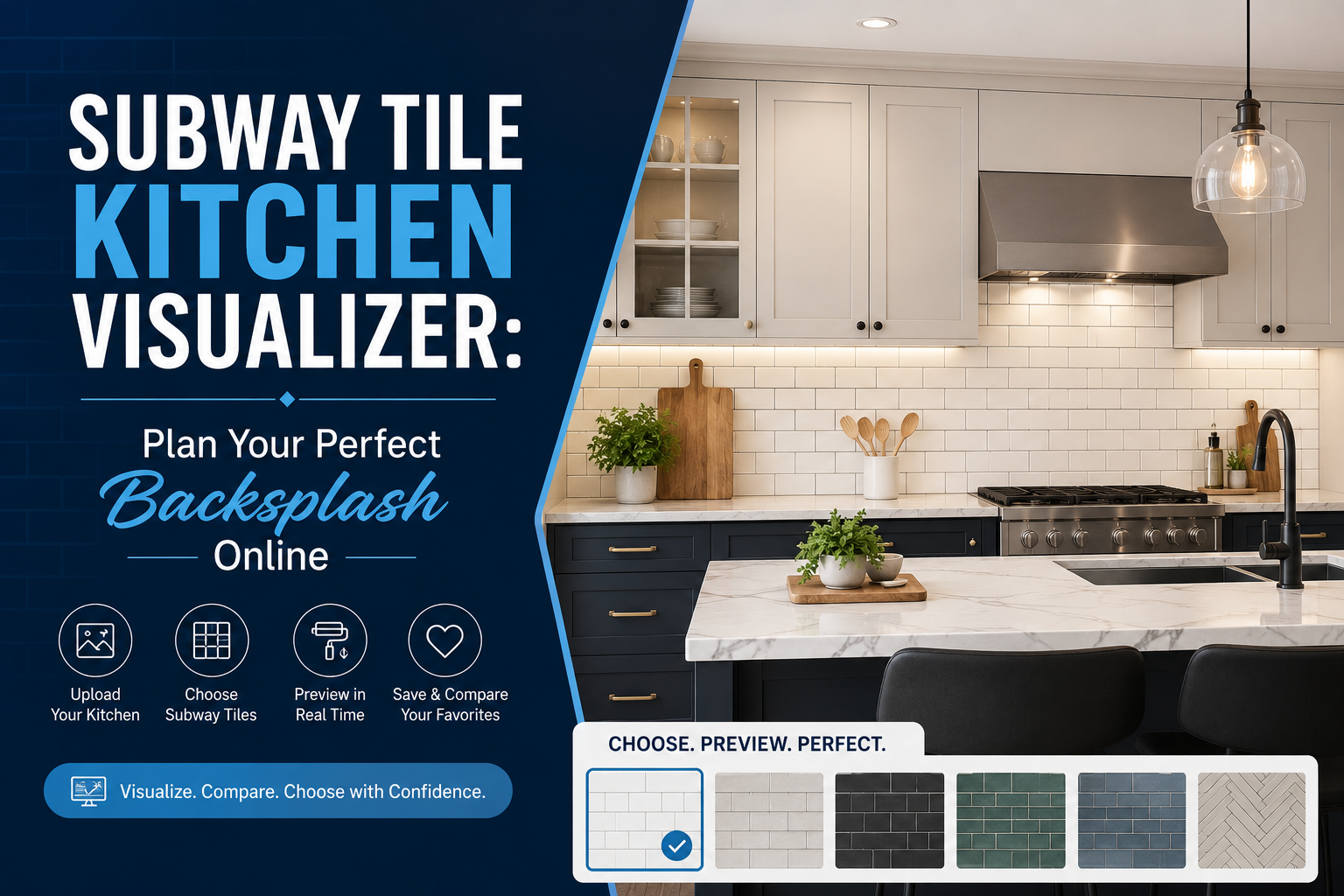
Subway tile has been a kitchen staple for over a century, and it's not hard to see why; the clean, rectangular shape works with almost any style, from a farmhouse kitchen to a sleek modern build. But "subway tile" isn't really one look. The same tile shape can read as crisp and minimal or warm and traditional depending entirely on color, grout, orientation, and layout. That's exactly where a subway tile kitchen visualizer earns its place in the planning process: it lets you see how those choices actually come together in your own kitchen before you commit to buying anything.
Subway tile has stayed popular for a simple reason: it's flexible. A plain white 3x6 tile can look completely different depending on how it's installed, and that adaptability is part of why it remains a default choice for so many kitchen renovations. But choosing "subway tile" as a category doesn't actually make the decision for you. The real decision happens in the details: which color, which layout, which grout, and how it all sits against your existing cabinets and countertops.
A single subway tile design can shift dramatically depending on its surroundings:
A crisp white subway tile against dark walnut cabinets creates a bold, high-contrast look. That same tile against white shaker cabinets creates something far more subtle and monochromatic. Neither is right or wrong, but they're genuinely different results from the same product, which is exactly why context matters so much in this decision.
A single sample tile, or even a small board with a few tiles glued together, can't show you how a full backsplash reads across an entire wall. Grout lines repeat, patterns emerge, and the tile's relationship to your cabinets and counters only becomes clear once it's covering real square footage, something that's genuinely hard to picture from a small physical piece alone.
A subway tile kitchen visualizer is a tool built specifically to solve this problem. Instead of imagining how a tile might look, you can see it directly applied to a photo of your own kitchen. These tools let you:
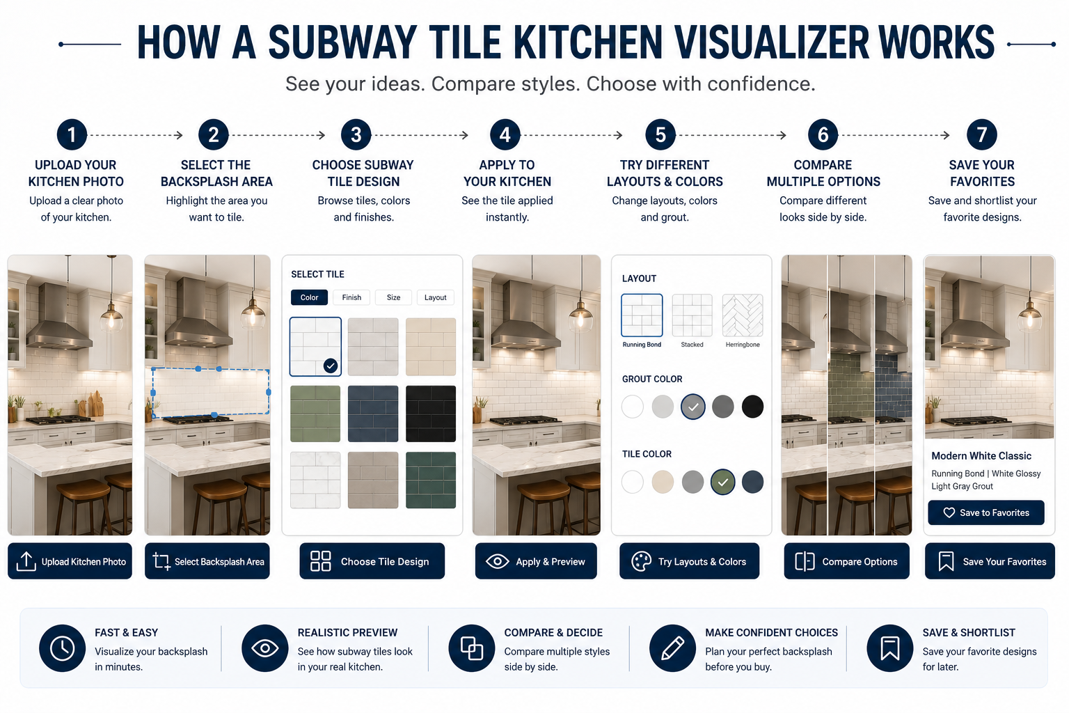
Using a subway tile backsplash visualizer typically follows a simple sequence:
The whole process usually takes a few minutes and replaces what used to require physically holding tile samples up against your wall and imagining the rest.
Before jumping straight into color and pattern choices, it helps to establish a few basics about your specific kitchen and goals.
Take stock of what you're working with, cabinet color, countertop material, flooring tone, appliance finish, and wall color. These elements aren't changing (at least not right now), so your subway tile choice needs to work with them, not against them.
Backsplash coverage varies quite a bit depending on the look you want:
This decision affects both budget and visual impact, and it's worth settling before you start comparing tile colors and patterns.
Subway tile adapts to nearly every kitchen style, but the way it's used should match the room's overall direction, modern, traditional, farmhouse, minimalist, contemporary, or industrial. A herringbone layout in a saturated color reads very differently from a simple white running-bond pattern, even though both use the same basic tile shape.
Color is often the single biggest factor in how a subway tile backsplash ultimately feels, and it's a major driver of subway tile color combinations searches for good reason, the options genuinely change the kitchen's entire character.
White remains the most popular subway tile choice because it's flexible, brightens smaller kitchens, and works with virtually any cabinet or countertop color.
Dark subway tile, particularly in matte black or deep charcoal, creates a bold, high-contrast look that works well in kitchens with lighter cabinetry and countertops looking for a dramatic focal point.
Sage green, navy, and soft blue subway tiles have become popular for kitchens looking to add personality without committing to a full color renovation, a colored backsplash can transform a neutral kitchen without touching cabinets or countertops.
Cream, beige, and warm ivory tones pair especially well with wood cabinetry and natural stone countertops, creating a softer, more organic look than stark white.
The challenge with all of these options is that color often looks different once it's actually surrounded by your specific cabinets, countertops, and lighting, which is exactly where a visualizer becomes useful, letting you compare these color directions directly against your own kitchen rather than a showroom wall.
Color gets most of the attention, but subway tile layout choices can shift the final look just as much, sometimes more.
The traditional offset brick pattern, where each row is staggered by half a tile. This is the most recognizable subway tile layout and tends to feel timeless rather than trendy.
Tiles installed with the long edge running vertically instead of horizontally. This layout can make a kitchen feel taller and is often used to draw the eye upward in spaces with lower ceilings.
Tiles aligned directly on top of one another rather than offset, creating clean, continuous grid lines. This layout tends to read as more modern and minimal than a traditional running bond.
Tiles arranged at an angle to create a zigzag pattern. Herringbone adds significant visual movement and works particularly well as a feature behind a range or cooktop.
Beyond the standard options, some kitchens use a mixed or custom offset, a one-third offset instead of the classic half-tile stagger, for example, to create a subtly different rhythm without going as bold as herringbone.
Each of these subway tile patterns can dramatically change how the exact same tile color reads on a wall, which is one more reason it's worth testing layout options before finalizing an order rather than choosing based on a photo of someone else's kitchen.
Grout is easy to overlook, but it plays a bigger role in the finished look than most buyers expect.
Pairing white tile with white or very light grout creates a soft, seamless look with minimal visual break between tiles, ideal for a clean, understated backsplash.
Dark grout against white or light tile makes each individual tile stand out clearly, emphasizing the layout pattern itself rather than blending it into a single surface.
Choosing a grout shade that closely matches the tile color minimizes the grid pattern almost entirely, letting the tile color itself take center stage rather than the layout.
Because grout color can change a backsplash's entire personality, even with the exact same tile, it's worth testing a few grout options directly against your chosen tile design before finalizing anything. Small grout samples are notoriously hard to judge in isolation, since their real impact only shows once they're seen running between dozens of repeated tiles.
Color and layout get most of the attention, but the material a subway tile is made from changes how it looks, performs, and holds up over time — and it's worth deciding on early, since it affects how accurately any color preview will translate to your actual kitchen.
The most common and budget-friendly option, ceramic subway tile comes in a huge range of colors and glaze finishes, from flat matte to high gloss. It's easy to work with and widely available, which is why it remains the default choice for most subway tile backsplashes.
Denser and more moisture-resistant than standard ceramic, porcelain subway tile holds up well to the heat, grease, and regular wiping a kitchen backsplash sees daily. It's a strong choice for buyers who want the classic subway look with a bit more durability built in.
Marble brings natural veining and a soft, light-catching surface that reads as more upscale than ceramic or porcelain. Because every slab is naturally unique, marble subway tile also needs regular sealing to resist staining from oil and acidic spills, which is worth factoring into ongoing maintenance.
Glass tile has a reflective, almost luminous quality that ceramic and porcelain can't fully replicate, making it a popular choice for buyers after a sleeker, more contemporary backsplash. It reflects light more dramatically than matte materials, so a glass tile in the same color as a ceramic option can still look noticeably different once installed.
Because a subway tile kitchen visualizer applies color and pattern to your room photo, it's worth remembering that glossy materials like glass or marble will reflect more light in person than a flat digital preview shows, while matte ceramic will generally look closer to what you see on screen. Keeping this in mind helps you interpret a visualizer preview more accurately — and it's one more reason a physical sample is worth checking before placing a full material order, not just a color one.
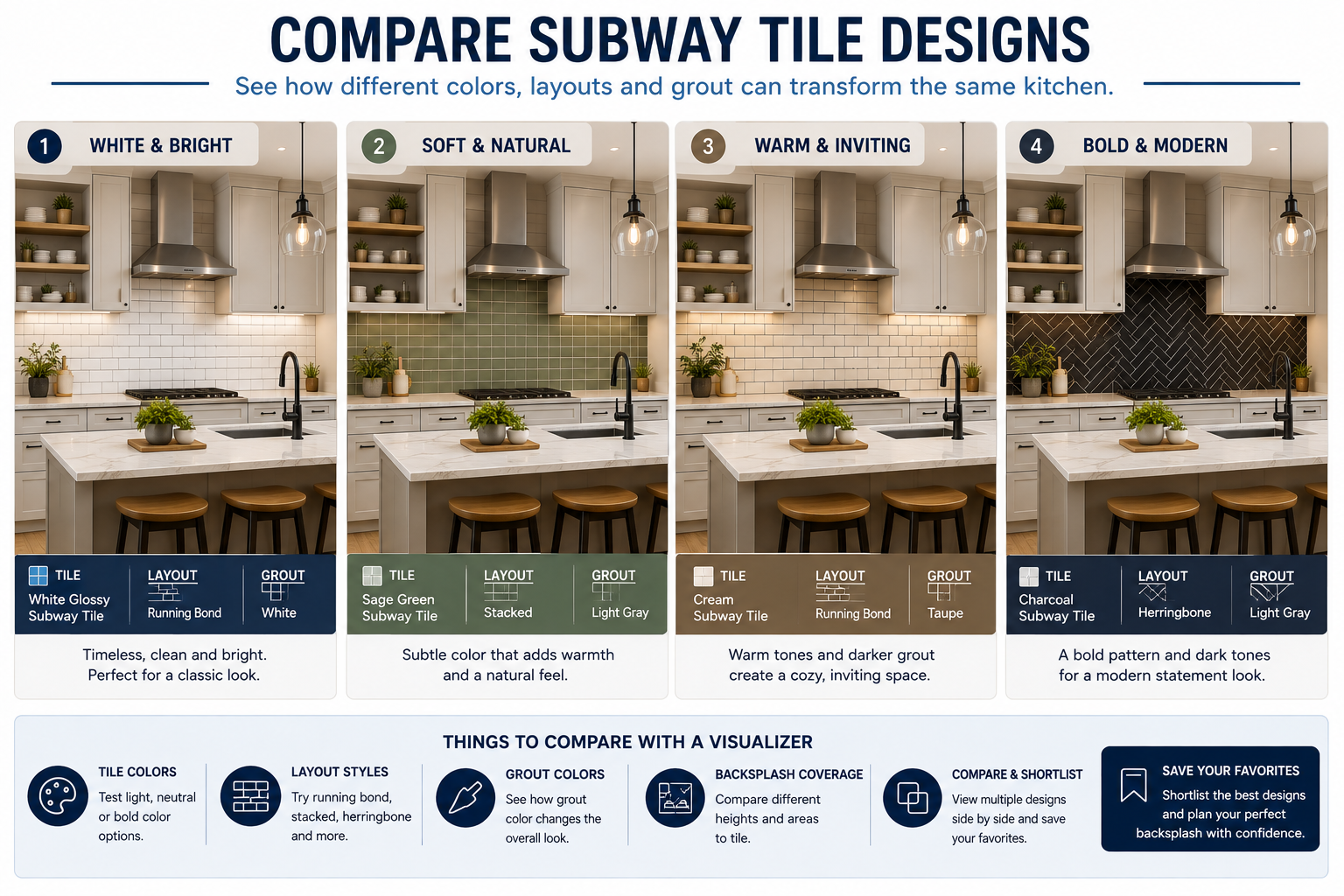
Once you understand the individual variables, color, layout, and grout, a kitchen backsplash visualizer becomes genuinely useful for putting them together and comparing full combinations.
Swap between white, black, green, or neutral tile options instantly, without ordering physical samples of each.
Test running bond against herringbone or vertical layouts using the exact same tile color, to isolate how much the pattern itself changes the result.
See how the same tile and layout shift in character with light grout versus dark grout versus a matching tone.
Preview how the design looks with standard counter-to-cabinet coverage versus a full-height installation.
Once you've narrowed things down, save your top combinations so you can revisit and compare them later, or share them with a contractor or designer.
Rather than a generic inspiration list, it helps to think about subway tile kitchen ideas organized by the style you're actually working with.
White or neutral subway tile, minimal grout contrast, and a clean stacked or simple running-bond layout tend to suit modern kitchens best, keeping the backsplash understated against sleek cabinetry.
Warm white tones, a slightly handmade-looking finish, and a traditional running bond layout tend to fit farmhouse kitchens, complementing shaker cabinets and natural wood accents.
Larger-format subway tiles, bolder colors, and stacked layouts suit contemporary kitchens looking for a more graphic, architectural backsplash statement.
Lighter colors, vertical layouts, and slightly reflective glazed finishes can help a small kitchen feel more open, since they reflect more light and create a sense of height.
There's a meaningful difference between looking at a subway tile's product image on a supplier's website and actually seeing that tile within your own kitchen. A product photo shows the tile in ideal, generic lighting against a neutral background; it tells you almost nothing about how it will interact with your specific cabinets, countertop, and window placement.
The process starts with your actual kitchen, not a stock photo or showroom display, which immediately makes any preview more relevant to your real decision.
From there, you can apply and swap between different tile options quickly, letting you visualize subway tile backsplash choices without any physical commitment.
Once you've narrowed things to your top two or three favorites, compare them directly against each other in the same kitchen photo to make the final call easier.
Buyers who see subway tile in my kitchen through this kind of tool, rather than guessing from a small sample, tend to feel far more confident about their final choice, since they're not relying on imagination to fill in the gaps. The ability to visualize backsplash before buying removes a significant amount of the uncertainty that traditionally came with this kind of purchase.
A few recurring mistakes show up again and again in kitchen renovations, and most are avoidable with a bit of upfront planning.
Grout color is often an afterthought, chosen at the last minute, but as covered earlier, it can change the entire look of the finished backsplash.
A tile that looks great under a showroom's lighting can look noticeably different under your kitchen's under-cabinet lighting or natural window light.
A small sample simply can't show how a repeated pattern will look across an entire wall; this is one of the most common sources of post-installation regret.
Layout has a huge visual impact, but it's often chosen based on trend rather than how it will actually look with the buyer's specific tile color and kitchen.
A backsplash doesn't exist in isolation; it needs to work with everything else already in the room, not just look good on its own.
Combining a busy tile layout with an already-patterned countertop or floor can create visual clutter rather than a cohesive design.
|
Selection Method |
Traditional Approach |
Visualization Approach |
|
View tile |
Product/sample |
Product + kitchen |
|
Compare colors |
Limited |
Easy |
|
Test layouts |
Difficult |
Easy |
|
Test combinations |
Time-consuming |
Fast |
|
Use actual kitchen |
Usually no |
Yes |
|
Shortlist designs |
Manual |
Faster |
|
Physical verification |
Yes |
Still recommended |
Even with all of these advantages, it's worth being clear that visualization doesn't replace physical samples entirely. It dramatically narrows down your options and reduces guesswork, but a final physical check of color and texture remains an important last step before placing a full order.
Bringing everything together, here's a practical process for making the final decision.
Start with the fixed element you're building around; cabinet color and finish will influence almost every other choice.
Note your countertop's tone, pattern, and material, since your backsplash needs to complement rather than compete with it.
Narrow down to two or three color directions based on your cabinets and countertop.
Decide between a running bond, vertical, stacked, herringbone, or an offset pattern based on your kitchen's style.
Compare light, dark, and matching grout options against your chosen tile and layout.
Apply your top combinations to a photo of your actual kitchen to see how they come together.
Once you've settled on a favorite, request a physical sample to confirm color and texture before placing your full order.
Consider a kitchen with white cabinets, a wood countertop, and warm-toned flooring. The homeowner is deciding between three backsplash directions:
Using a subway tile backsplash visualizer, they apply each option directly to a photo of their kitchen. The white-on-white option ends up looking a little flat against the already-white cabinets, while the sage green creates a subtle but noticeable contrast that plays well with the wood countertop. The cream tile with contrasting grout adds definition without feeling as bold as the green. Seeing all three side by side in the actual kitchen, rather than guessing from tile samples alone, makes it much easier to choose confidently between them.
Getting a backsplash decision wrong isn't a small mistake. Changing course after installation typically means:
Visualization doesn't guarantee a perfect result, but it meaningfully reduces avoidable uncertainty before installation begins, which is exactly the kind of expensive mistake most homeowners are trying to avoid in the first place.
Yes. Most modern visualizer tools let you upload a photo of your actual kitchen and apply different subway tile designs directly to your backsplash area, rather than relying on generic catalog photos.
There's no single best layout; running bond suits traditional kitchens, stacked and vertical layouts suit modern spaces, and herringbone works well as a bold feature behind a range.
It depends on the look you want. Matching grout creates a seamless appearance, while contrasting grout emphasizes the tile pattern and individual tile shapes more clearly.
Yes, white subway tile remains one of the most requested options because of its flexibility with different cabinet colors, countertop materials, and kitchen styles.
Yes. A kitchen tile visualizer lets you switch between different tile colors on the same kitchen photo, making it much faster to compare options than ordering physical samples of each one.
Yes, most tools allow you to test different layout orientations, such as running bond, vertical, or herringbone, using the same tile design, so you can isolate how much the pattern itself changes the look.
Yes. Visualization is excellent for narrowing down your options, but a physical sample remains the best way to confirm true color and texture before placing a full order.
Don't choose a subway tile only because it looks good in a catalog photo or in someone else's kitchen. A better process is straightforward: Choose → Visualize → Compare → Shortlist → Sample → Verify → Install.
A subway tile kitchen visualizer isn't a replacement for good design judgment; it's a decision-support tool that helps you understand how tile color, layout, and grout actually work together with your cabinets, countertops, and lighting before you're committed to a full order. Used well, it turns a decision that used to rely on guesswork into one you can make with real confidence.