


















Elevate Your Interiors
with Trendy Tiles Display
Tiles That Speak the Language of Design.
14th Aug, 2026
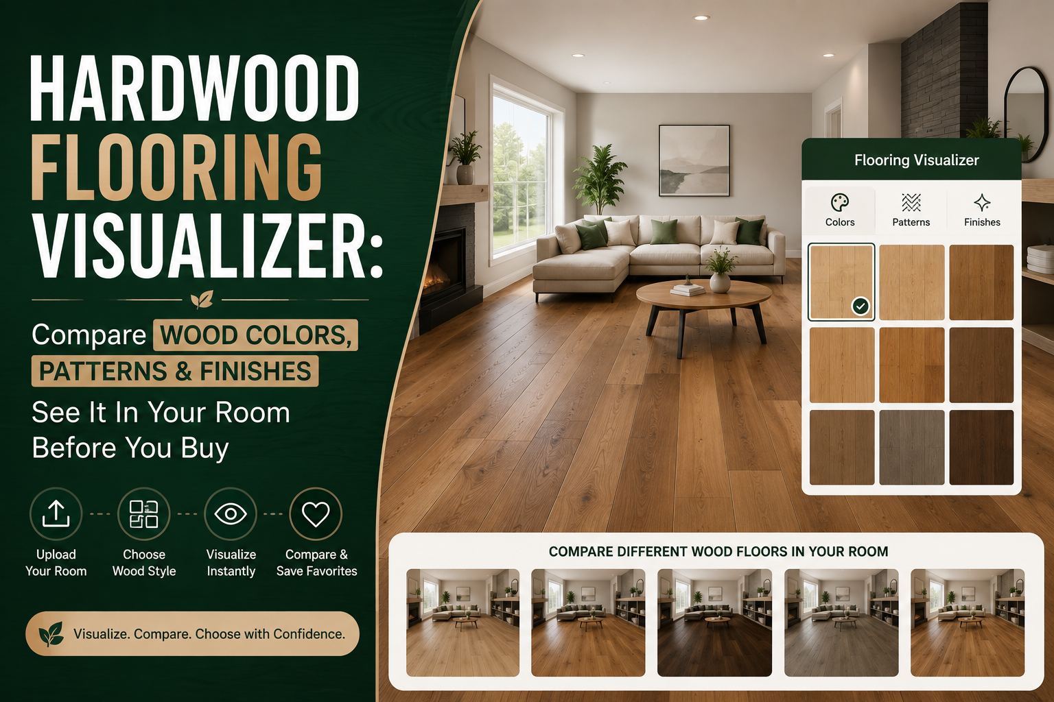
Choosing hardwood flooring from a small sample or a catalog photo is a bit like choosing paint from a tiny swatch; technically, you've seen the color, but you have almost no sense of what it will actually feel like covering your entire living room. Wood tone, grain, plank direction, pattern, finish, your furniture, your wall color, and your room's lighting all combine to create the final look, and none of that comes through in a 6-inch plank sample. A hardwood flooring visualizer solves this by letting you compare these choices directly within a realistic version of your own room before you commit to a purchase.
So how do you actually compare hardwood colors, patterns, and finishes with any real confidence before buying? That's what this guide walks through.
A flooring sample that looks beautiful in the store doesn't automatically mean it will work in your space. Several factors shape how a floor actually reads once it's installed:
Any one of these can shift a floor from "exactly what I pictured" to "not quite right" once it's actually installed.
A single plank sample is a tiny fraction of an entire floor. Wood grain, color variation, and plank seams that look subtle on one small piece can look completely different once repeated across hundreds of square feet. It's genuinely difficult to mentally scale a small sample up to an entire room, which is exactly why so many homeowners end up surprised by how a floor looks once installation is complete.
Wood tone shifts noticeably depending on the light hitting it. Morning sunlight tends to bring out warmer undertones, afternoon light can flatten or cool a floor's appearance, and artificial lighting in the evening often shifts things again. A warm honey oak that looks rich and golden at noon might look considerably more muted under evening lamp light, something a small in-store sample simply can't demonstrate.
A hardwood flooring visualizer is a tool that lets you preview different flooring options directly within a photo of your actual room, rather than relying on imagination or a small physical sample. The typical process looks like this:
The real value of a wood floor visualizer isn't simply seeing a floor rendered digitally, it's understanding how that flooring interacts with everything already in your room. A floor doesn't exist on its own; it sits below your furniture, against your walls, and under your lighting. Seeing all of that together, rather than judging the floor in isolation, is what actually helps buyers make a confident decision.
Color is usually the first and biggest decision homeowners face, and it dramatically changes a room's overall character.
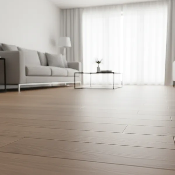
Light tones like natural oak tend to brighten a space and work particularly well in smaller rooms, since they reflect more light and can make a room feel larger. They're also a natural fit for minimalist and Scandinavian-inspired interiors that lean on light, airy palettes.
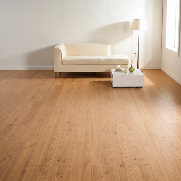
Warm browns, honey tones, and natural oak sit in the middle of the spectrum and tend to be the most versatile choice. They pair comfortably with a wide range of wall colors and furniture styles, which makes them a common pick for transitional interiors that don't lean strongly modern or traditional.
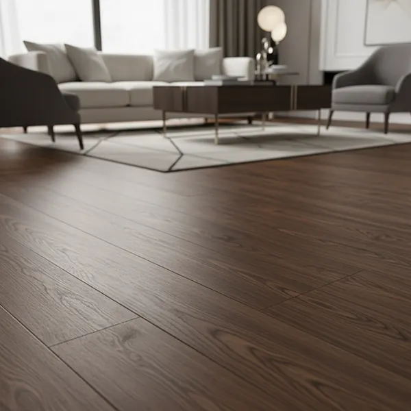
Walnut-inspired tones and rich, deep browns create a dramatic, grounded look, especially when paired with lighter walls for contrast. Dark floors tend to suit larger rooms with ample natural light, since they can make a smaller or dimmer space feel more closed in.
The reason comes down to light reflection. Dark wood absorbs far more light than it bounces back into the room, so a floor that reads as rich and sophisticated in a bright showroom can noticeably dim a room with limited windows or north-facing light once it's installed. Buyers often make this choice based on a small sample or a close-up product photo, without accounting for just how much visual "weight" a dark floor adds once it covers an entire room rather than a few square inches. This is one of the more expensive flooring regrets to walk back, since it usually isn't obvious until the full floor is down, comparing light, medium, and dark options directly against your own room's actual lighting beforehand is the easiest way to catch this before it becomes a problem.
Beyond simple lightness and darkness, wood tone also carries an undertone, warm (red, orange, or golden) or cool (grey, ash, or muted brown). Neither is inherently better; the right choice depends on your existing hardwood floor colors, preferences, and how they'll sit against your walls and furniture. A warm-toned floor can clash with a cool grey wall palette, while a cooler wood tone might feel flat against warm wood furniture. Matching undertones, not just overall shade, is often what separates a floor that feels cohesive from one that feels slightly off.
This matters just as much for fixed architectural elements as it does for furniture. Kitchen cabinets, door and window trim, stair railings, and stone countertops all carry their own undertones, and these can't be swapped out as easily as a sofa or rug if the flooring ends up clashing with them. Two wood finishes that look nearly identical in a catalog photo can read very differently once placed next to a cabinet with a strong yellow or grey undertone, one might blend in seamlessly, while the other creates an unintended contrast. Comparing several wood floor colors directly against your actual cabinetry and trim, rather than judging the flooring in isolation, is usually the fastest way to catch this kind of mismatch before it becomes a permanent part of the room.
Light, neutral walls give you the most flexibility, working with nearly any wood tone. Warmer wall colors tend to pair best with warm-toned wood, while cooler or more neutral grey walls often suit cooler wood tones better.
Decide whether you want your flooring to blend with your furniture for a cohesive, monochromatic look or contrast with it to make each element stand out. Both approaches work; it's a matter of the overall feel you're going for.
Rooms with abundant natural light can handle darker flooring without feeling closed in, while rooms with limited natural light generally benefit from lighter tones that help maximize the sense of brightness and space.
Your flooring choice should generally align with your home's broader style, modern, traditional, Scandinavian, rustic, contemporary, or luxury. A rustic space tends to favor wider planks with visible grain and knots, while a modern space often leans toward cleaner, more uniform tones.
Working through how to choose hardwood floor color ultimately comes down to weighing these four factors together, rather than picking a color in isolation from a showroom display.
Color isn't the only variable that shapes how a floor looks, pattern and plank layout matter just as much.
The most common and classic layout, with planks running in parallel rows. It creates a clean, traditional look that suits nearly any interior style without competing for attention.
A directional pattern where planks are arranged at right angles to form a zigzag effect. Herringbone adds significant visual movement and often becomes a design feature in its own right, particularly in entryways or dining rooms.
Often confused with herringbone, chevron uses planks cut at an angle so they meet in a continuous, uninterrupted V shape, rather than herringbone's slightly offset zigzag. Chevron tends to read as more formal and graphic than herringbone.
Wider boards reduce the number of visible seams across a room, which can make a space feel more expansive and modern. Narrower planks, by contrast, tend to feel more traditional and can make a room feel slightly busier due to the increased number of seams.
Both wood floor patterns and plank width play a real role in hardwood floor design, and like color, they're much easier to evaluate once you can see them applied across your actual room rather than a small display board.
Plank direction is a detail that's often overlooked, but it has a real effect on how a room feels.
Running planks parallel to a room's longest wall is one of the most common approaches, and it tends to create a natural, elongated sense of flow through the space.
Running planks perpendicular to the longest wall can make a narrow room feel wider, since the eye follows the shorter dimension rather than the longer one.
In open-plan homes, maintaining a single, consistent plank direction across connected rooms generally creates a more unified, seamless look, while switching direction between spaces can create a visual break that some homeowners use intentionally to define separate zones.
Because direction is hard to judge from a small sample, this is another area where seeing the flooring applied to a photo of your actual room, rather than guessing, makes a noticeable difference in the final decision.
The same wood color can look meaningfully different depending on its finish.
Matte Hardwood Finish
Matte finishes create a natural, understated look with minimal shine, and they tend to show fewer scuffs and footprints over time compared to higher-gloss options.
Satin sits between matte and gloss, offering a subtle sheen that adds a bit of depth and richness to the wood without looking overly polished. It's one of the most commonly chosen finishes for this reason.
Glossy finishes reflect more light and can make a wood's color and grain appear more vivid and saturated, though they also tend to show scratches, dust, and footprints more visibly than lower-sheen options.
A medium oak in matte finish can look noticeably more muted and casual than the exact same wood in a glossy finish, which will typically appear richer and more saturated under the same lighting. This is one of the clearest examples of why hardwood floor finishes deserve just as much attention as color, and why comparing finish options side by side, in context, is so useful before making a final choice.
Rather than evaluating color, pattern, and finish as separate decisions, a hardwood flooring visualizer lets you test full combinations together, such as:
Switch between light, medium, and dark tones directly on a photo of your room to see how each one actually reads against your walls and furniture.
Apply the same wood color in straight plank, herringbone, or chevron layouts to isolate how much the pattern itself changes the room's feel.
See how matte, satin, and glossy options shift the same wood tone's overall richness and reflectiveness.
Because the room stays constant while you swap flooring options, it becomes much easier to judge how each combination actually sits alongside your existing furniture, rugs, and wall colors, something a wood floor visualizer is specifically built to make easier than physical sampling alone.
There's a real difference between seeing flooring in a generic showroom display and seeing it in your own space. Showroom displays are staged with ideal lighting and furniture chosen specifically to flatter the flooring, conditions that rarely match your actual room.
Your own space brings a different set of variables into the decision:
Tools that let you visualize hardwood floors using your own room photo account for all of this at once, rather than asking you to mentally subtract the showroom's staging and imagine your own space instead. Being able to see hardwood floors in my room with your actual furniture and lighting in the frame, gives a far more honest preview than any generic display. This is exactly why so many buyers now prefer to visualize wood flooring before buying, rather than relying on a showroom visit alone.
Living rooms typically have the largest continuous floor area in a home, so flooring choices here carry significant visual weight. Consider how the floor will read alongside major furniture pieces and how it flows into adjoining spaces.
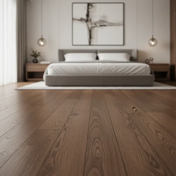
Bedrooms tend to benefit from warmer, softer tones that support a calming atmosphere, since this is a space meant for rest rather than dramatic visual statements.
Dining rooms see regular wear from chairs and foot traffic, so durability matters alongside appearance. A slightly warmer tone or a more defined pattern like herringbone can also help anchor the space as a distinct dining area within an open floor plan.
In open-plan homes, maintaining visual consistency across the kitchen, living, and dining areas generally creates a more cohesive overall look, since the eye can see multiple zones simultaneously without a wall to break up the sightline.
Every one of these applications benefits from the same underlying principle, hardwood flooring ideas are far more useful when tested against your actual room rather than viewed as generic inspiration photos.
A tiny sample rarely reflects how a color will read across an entire room, especially once grain variation and lighting come into play.
Judging a floor sample only under one type of lighting, whether store lighting or a quick glance near a window, can lead to surprises once it's installed under your home's actual lighting conditions throughout the day.
Choosing a floor that matches your furniture and walls too precisely can sometimes make a room feel flat, with no visual definition between elements.
A wood species with pronounced grain, knots, or heavy color movement can look rich and characterful on a single sample, but that same activity repeated across dozens of planks in a full room can start to feel visually busy or chaotic rather than charming. The opposite happens too, a subtle, low-grain sample that looks plain in isolation can actually create a calmer, more elegant result once it's spread across a larger floor. Grain density is genuinely difficult to judge from a small piece, which is exactly why it's worth seeing a wider section of the pattern, not just one plank, before committing.
Plank direction is easy to overlook but can meaningfully affect how a room's proportions feel once the floor is installed.
A glossy finish that looks striking in a showroom might feel too reflective or busy in a smaller, more heavily furnished room.
No matter how helpful digital previews are, skipping a final physical check of the actual product before a full order is one of the most common, and costly, mistakes buyers make.
Flooring mistakes are cheap to fix on paper and expensive to fix in practice, and the cost climbs sharply depending on when the mistake is caught. Changing your mind before ordering costs nothing more than a bit of extra research time. Changing your mind after the material has been delivered often means a restocking fee, and in some cases the retailer won't take open boxes back at all. Catching the problem after installation is the most expensive scenario of all, it typically involves removing and disposing of the installed flooring, paying for labor twice, buying replacement material, and living with a disrupted home for however long the redo takes.
This is exactly why the goal of visualization isn't to guarantee a perfect outcome, it's to move as many of these decisions as possible to the "costs nothing to change your mind" stage, before any material or labor has been committed.
|
Factor |
Traditional Sample |
Flooring Visualization |
|
See actual material |
Excellent |
Limited |
|
Check physical texture |
Excellent |
Limited |
|
See flooring in your room |
Limited |
Excellent |
|
Compare many colors |
Time-consuming |
Easy |
|
Compare patterns |
Difficult |
Easy |
|
Test finishes |
Limited |
Easy |
|
Evaluate room context |
Limited |
Excellent |
|
Final physical verification |
Essential |
Still required |
This table reflects a simple underlying principle: visualization and physical samples aren't competing tools, they're solving different problems. A physical sample tells you what the actual product is, its true color, its texture, its finish quality under real light. A visualizer tells you how that product will look in your specific space, alongside your specific furniture and walls, something no small sample piece can realistically convey.
Buyers who treat these as complementary tools, rather than picking one over the other, tend to move through the decision process faster and with far more confidence. Visualization narrows a large field of options down to a realistic shortlist; physical samples then confirm that the shortlisted choice is exactly what it appeared to be on screen. Skipping either step increases the risk of an unwelcome surprise once the floor is actually installed.
Start with a clear, well-lit photo of the actual room you're flooring.
Get a general sense of direction, modern, traditional, rustic, Scandinavian, or something else.
Apply a range of tones to your room photo to see which general direction feels right.
Compare straight plank, herringbone, and other layout options using your preferred color.
See how matte, satin, and glossy options change the appearance of your chosen wood tone.
Narrow your favorites down based on how they look in your actual space.
Request samples of your shortlisted options to confirm real color and texture.
Verify durability ratings, installation requirements, and care instructions before placing your final order.
The overall journey looks like this: Room Photo → Explore → Visualize → Compare → Shortlist → Sample → Verify → Buy
Consider a medium-sized living room with white walls, a beige sofa, wooden furniture accents, and large windows that let in plenty of natural light throughout the day. The homeowner is weighing three flooring directions.
Option 1: Light Oak. Applied to the room photo, light oak brightens the space and creates an airy, open feel that complements the large windows, though it blends fairly closely with the existing beige sofa.
Option 2: Medium Warm Brown. This tone adds more visual warmth and creates a gentle contrast with the white walls, while still coordinating comfortably with the wooden furniture already in the room.
Option 3: Dark Walnut. Dark walnut creates a dramatic, grounded look that stands out sharply against the white walls, though in this particular room it reads as a bit heavier than the other two options given the room's moderate size.
Comparing all three directly in the same room photo, rather than trying to judge them from separate small samples, makes the trade-offs immediately clear. In this case, the medium warm brown ends up striking the best balance between warmth and openness, and the homeowner moves forward by ordering physical samples of just that option to confirm color and texture before purchasing.
No. Digital visualization and physical samples serve genuinely different purposes in the buying process.
A visualizer is better for:
Physical samples are better for:
Treating these as complementary steps, rather than choosing one over the other, remains the most reliable way to arrive at a flooring decision you'll actually be happy with once it's installed.
A hardwood flooring visualizer is a digital tool that lets you preview different wood flooring colors, patterns, and finishes directly on a photo of your own room, rather than relying on small physical samples or imagination alone.
Yes. Most modern visualizer tools let you upload a photo of your actual room and apply different flooring options to it, giving you a much more realistic sense of the final result than a generic showroom display.
Yes, you can typically switch between light, medium, and dark wood tones on the same room photo within seconds, making it far faster to compare options than ordering and waiting on multiple physical samples.
Yes. Many tools let you apply the same wood color in different layouts, straight plank, herringbone, or chevron, so you can see how much the pattern itself changes the room's overall look.
Yes, finish comparison is one of the more useful features, since the same wood color can look noticeably different depending on its sheen level, and this is often hard to judge accurately from a small sample.
Lighter wood tones generally work best in smaller rooms, since they reflect more natural light and tend to make the space feel more open, though the right choice ultimately depends on your walls, furniture, and available natural light.
Yes. A visualizer is excellent for narrowing down your options and understanding room context, but a physical sample remains the most reliable way to confirm true color, texture, and finish before placing a full order.
Hardwood flooring is one of the most visually significant decisions in any home renovation, and a small in-store sample simply doesn't provide enough context to make that decision with full confidence. A hardwood flooring visualizer helps homeowners compare colors, patterns, plank styles, and finishes directly within their own rooms, replacing guesswork with a much clearer picture of the final result. Even so, the process shouldn't stop there, checking the actual flooring product and confirming its specifications remains an essential final step before placing an order.
The most reliable path forward follows a simple sequence: Explore → Visualize → Compare → Shortlist → Sample → Verify → Install.